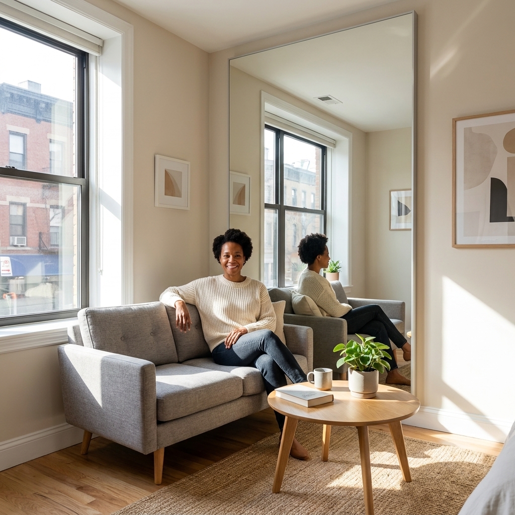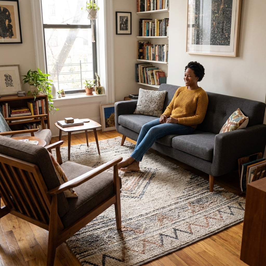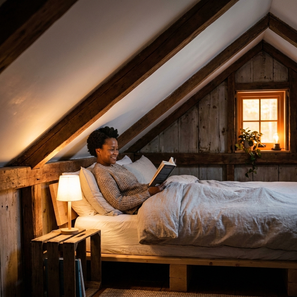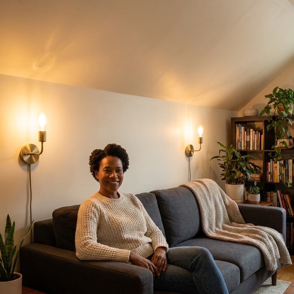
Seven renter-friendly lighting moves that visually lift your ceiling, brighten dark corners, and make a small apartment feel more open.
Space Ovo
9 Dark Paint Colors That Make Small Rooms Feel Bigger
Deep paint can expand a small room visually. Explore 9 dark, moody color families that blur edges, add depth, and feel sophisticated in tiny bedrooms and living rooms, plus practical tips on sampling, sheen, and lighting.

Maya Brooks
Maya Brooks is an interior stylist and layout enthusiast who believes square footage should never dictate your home's style. After a decade of navigating cramped city studios, she shares practical, renter-friendly decorating and storage solutions to help others maximize their tiny spaces.
Created October 17, 2026
Updated October 17, 2026
I know, I know. The first rule of tiny-apartment living we all get handed is: paint it crisp white. And yes, white can be lovely. But after years of living in studios where my bed, desk, and “dining area” all lived within a few steps of each other, I learned something surprising: dark paint can make a small room feel bigger.
Here is the trick. White walls show every corner, every bump-out, every awkward angle. Deep colors can do the opposite. They blur boundaries, soften transitions, and create a sense of depth that can feel like the walls quietly step back.
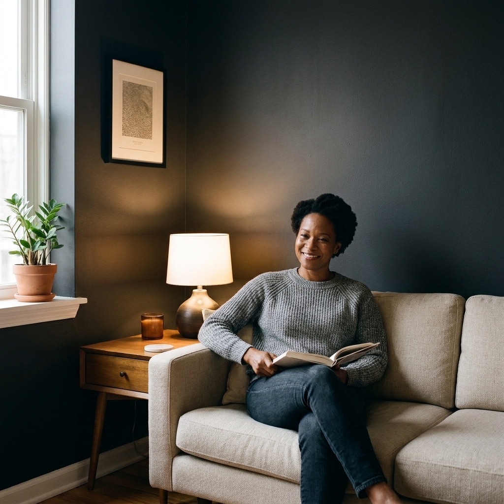
Below are 9 dark, moody color families that play especially well in small bedrooms and living spaces, plus exactly how to use each shade so it feels expansive, not cave-like.
Why dark can feel bigger
Think of a dark wall as a visual eraser. When the wall color is deep and consistent, your eye stops measuring every edge. Instead of scanning corners like a room inspector, you read the space as one calm, continuous envelope.
- Dark colors reduce contrast between walls, corners, and shadows, so the room’s perimeter is less “loud.”
- They hide awkward angles (hello, weird soffits and radiator bump-outs) because everything blends.
- They can create depth, especially in rooms with one window where bright white can look flat and slightly dingy.
It is not magic, though. Results depend on light levels, finish, and how visually busy the room is. Dark paint works best when the lighting is decent and the overall look is cohesive.
One huge renter-friendly note: you can get most of this effect with a single accent wall, or by painting only the lower half of the wall, if your lease is strict or your nerves are fragile.
Before you paint: 7 rules
1) Pick the undertone first
In small rooms, undertone is everything. A “navy” can read teal, a “black” can read brown, and a “green” can go swampy if it fights your flooring. When you test, compare at least two swatches with different undertones (cool vs warm).
2) Sample like you mean it
Do not judge a dark color from a tiny chip. Paint two large sample squares (or use peel-and-stick samples) and look at them in morning light, afternoon light, and at night with your lamps on. Dark shades can swing a lot.
3) Choose a finish that survives life
Matte looks luxe but can show scuffs. Gloss can highlight imperfections and glare. My sweet spot for most rentals: eggshell or satin on walls. If you want extra drama, do flat or matte on walls and satin on trim for subtle contrast that still feels seamless. If you have a high-traffic hallway or kids and pets, consider a scrubbable matte or satin for easier wipe-downs.
4) Keep the ceiling plan simple
Two options that usually work:
- Ceiling stays light (soft white) to keep things airy.
- Ceiling goes dark too to soften the “lid” effect in low-ceiling rooms. In tiny bedrooms, this can be surprisingly effective, especially if you have decent lamplight. In very low natural light, test first so it does not feel heavy.
5) Lighting is not optional
Dark walls love layered light. Aim for at least two light sources in a small room (a ceiling fixture plus a lamp, or two lamps). Warm bulbs in the 2700K to 3000K range usually make moody colors feel inviting, not murky. If you prefer a cleaner look, go a touch cooler, but avoid bulbs that make everything look gray and tired.
6) Plan for coverage
Dark paint often takes two coats, sometimes three. If you are going from white to deep color (or the reverse later), ask for a tinted primer or use a high-hide primer first. It is not glamorous, but it saves time and sanity.
7) Repeat one light element
If the walls are deep, give the eye a path: a light rug, pale bedding, a cream curtain, or a mirrored frame. You are creating contrast on your terms, not letting the room’s corners do it for you.
9 dark colors for small rooms
1) Inky navy
Why it works: Navy reads like a night sky. It feels deep and endless, which can make walls feel farther away.
Best for: Tiny bedrooms, narrow living rooms, and awkward open-plan nooks that need definition.
Pair it with: Cream textiles, warm woods, brass hardware, and art with white matting.
My go-to move: Paint the walls and the door the same navy. Fewer visual breaks can equal more “space.”
2) Charcoal gray (not pure black)
Why it works: Charcoal is a soft-focus filter for small rooms. It can hide corners and make furnishings pop without the harshness of true black.
Best for: Living rooms where you want the TV wall to disappear, small offices, and studio apartments where you need calm.
Pair it with: Linen upholstery, black frames, and a big light rug to keep the floor plane open.
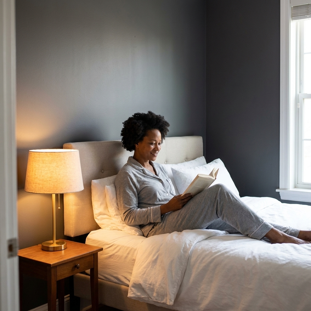
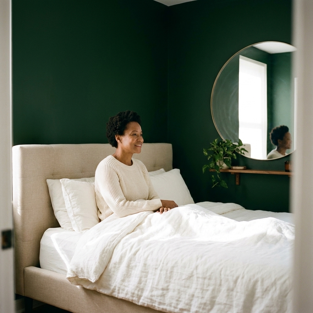
3) Deep forest green
Why it works: Forest green is grounded and dimensional. It adds depth without feeling cold, especially in rooms with warm afternoon light.
Best for: Bedrooms and small dining corners. Also gorgeous behind plants if your windows are limited.
Pair it with: Walnut tones, tan leather, creamy whites, and a little black for structure.
Small-space tip: Use matching green curtains or a close-tone textile. It can elongate the wall visually.
4) Blue-black (soft black)
Why it works: A blue-black reads as black at night and deep navy in daylight. That shifting quality adds visual depth, which is exactly what tight rooms need.
Best for: Boxy bedrooms, hallways, and tiny living rooms that feel a bit flat.
Pair it with: White or stone-colored trim, large mirrors, and warm bulbs so it stays rich instead of stark.
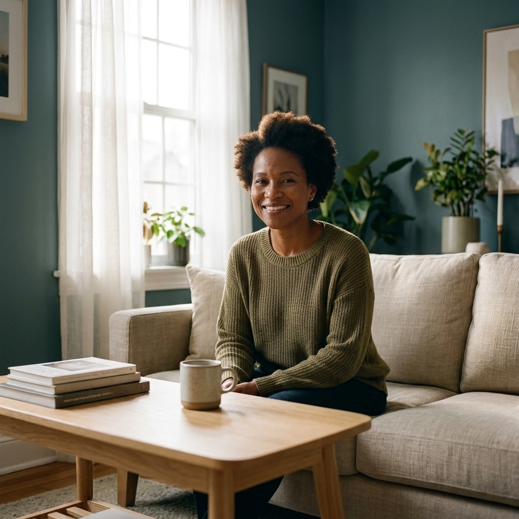
5) Smoky teal
Why it works: Teal sits between blue and green, so it has movement. A smoky, muted teal feels moody but still lively, and it can make a small room feel more layered.
Best for: Small living rooms and rental bedrooms that need personality without feeling busy.
Pair it with: Light oak, woven textures, soft whites, and art with warm neutrals.
6) Aubergine (deep plum)
Why it works: Deep purple tones can have a velvety effect that visually pushes walls back, especially when the color has a brown base rather than a bright violet base.
Best for: Bedrooms, especially if you want cozy hotel energy in a tiny footprint.
Pair it with: Warm metals, camel or blush accents, and creamy bedding.
My go-to move: Keep bedding mostly light, then add one deep accent (a throw or pillow) to echo the wall color.
7) Espresso brown
Why it works: Brown is the most underrated “make it bigger” dark. Espresso feels enveloping and hides shadows naturally, which can make a small room feel smoother and less chopped up.
Best for: North-facing rooms that feel icy, or spaces with lots of warm wood already in place (floors, shelves, furniture).
Pair it with: Ivory, caramel leather, rattan, and warm-white lighting.
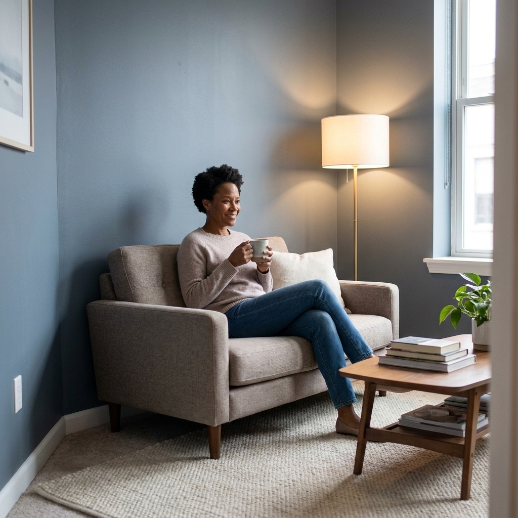
8) Slate blue-gray
Why it works: Slate is moody without being heavy. It has that stormy, atmospheric feel that creates depth while still reading “neutral.”
Best for: Small living rooms and studio apartments where you want one wall color that plays well with everything.
Pair it with: Black accents, white trim, and layered grays in textiles for a tonal look that can feel expansive.
9) Deep olive (muted, not bright)
Why it works: Olive with a muted, earthy undertone makes a small room feel grounded and cohesive. It can hide visual clutter better than many colors, which is half the battle in tiny spaces.
Best for: Bedrooms, entryways, and small rooms with lots of functional stuff out (coat racks, shelves, storage).
Pair it with: Off-white, natural linen, warm woods, and matte black hardware.
Where to go dark
Option A: All four walls
This is my favorite when you want the room to feel like one continuous space. Choose one deep color and commit. The more consistent the envelope, the more the corners can disappear.
Option B: Paint trim and doors
If you have a lot of doors or chunky trim, painting them the same color as the walls reduces visual breaks. Translation: the room reads calmer and often larger. If you cannot paint trim, keep it a soft white instead of a bright, high-contrast white.
Option C: One focal wall
If you are testing the waters, paint the wall your eye naturally lands on first (usually behind the sofa or the bed). Keep the other walls a warm, soft neutral, not icy white, so the contrast is not harsh.
Option D: The ceiling trick
In very small bedrooms, painting the ceiling the same dark color can make it feel taller by removing the stark cut line where wall meets ceiling. It sounds counterintuitive. It can work beautifully, but it is worth sampling first if your room gets very little natural light.
Keep it airy
- Use oversized art instead of many small frames. Less visual clutter, more openness.
- Go sheer at the windows or hang curtains high and wide to maximize perceived window size.
- Add one large mirror to bounce light. Place it across from a window if possible.
- Choose leggy furniture so you can see more floor. Visible floor reads as space.
- Keep your palette tight: 2 to 3 main colors plus one metal finish is plenty.
Quick FAQ
Will dark paint make my room feel smaller?
Not automatically. With decent lighting and a cohesive look, dark paint can make small rooms feel larger because corners and edges tend to recede. If your room is windowless or you rely on one harsh overhead bulb, it can feel flat or heavy, so plan your lighting first.
What is the safest dark color?
Slate blue-gray or charcoal. They act like neutrals, work with most furniture, and still give you that moody depth.
How do I keep it from feeling gloomy?
Layer warm lighting (lamps), add one or two light large-scale elements (rug, bedding, curtains), and choose a finish that does not swallow light completely (eggshell is a great middle ground). Also check your bulbs. Very cool or low-quality bulbs can make dark colors look muddy.
What if I am renting?
Start with a single wall, a deep color in removable wallpaper with a painted-look finish, or paint a small “zone” like a desk wall. If painting is allowed with a requirement to return to neutral, keep your leftover paint labeled and do a clean, careful cut-in now so touch-ups later are painless. Factor in primer and extra coats if you will eventually need to go back to white.
The takeaway
Small rooms do not need to whisper. Sometimes they need a rich, moody backdrop that makes everything feel intentional and a little more grown-up. If crisp white has you feeling like you live inside a takeout container, pick a dark shade with the right undertone, sample it in real light, layer your lamps, and watch your tiny room suddenly feel deeper, calmer, and yes, bigger.