11 renter-friendly ideas for using that empty space above eye level so your small apartment feels taller, brighter, and more intentional.
Space Ovo
Maximalist Gallery Wall, Minimal Space
Design a bold, maximalist gallery wall in a small apartment without visual clutter. Learn how to curate, frame, and space art for big impact in tight square footage.

Maya Brooks
Maya Brooks is an interior stylist and layout enthusiast who believes square footage should never dictate your home's style. After a decade of navigating cramped city studios, she shares practical, renter-friendly decorating and storage solutions to help others maximize their tiny spaces.
Created October 17, 2026
Updated October 17, 2026
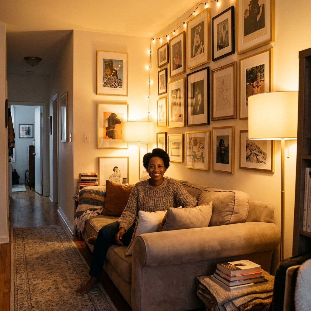
I love a maximalist gallery wall the way I love a great bag at a sample sale: it is a lot, it is expressive, and somehow it still works when you plan it like a pro. The trick in a small apartment is not shrinking your personality, it is giving your eyes a clear path to read the wall.
In other words, we are going bold without going busy. Here is how to curate, frame, and space a gallery wall that feels high-impact and breathable, even if your living room is technically also your dining room, office, and yoga studio.
Start with one decision
Maximalism looks best when it has one consistent rule. Pick one of these anchors and commit to it. Everything else can mix.
- Consistent frame color: All black, all oak, all white, or all brass. This is my go-to when the art styles are wildly different.
- Consistent mat color: A gallery wall with mixed frames looks instantly calmer when the mats are all warm white or bright white.
- Consistent vibe: For example, all vintage travel, all moody abstracts, all line drawings, all family photos, all gig posters. Frames can vary more if the subject matter is cohesive.
- Consistent spacing: The same gap between frames creates visual rhythm even when sizes change.
If you are decorating in a rental where the rest of the room is simple, I recommend choosing consistent spacing plus either consistent mat color or consistent frame color. Those two choices do a lot of heavy lifting in small spaces.
Curate like a stylist
I say this with love because I have been there: a gallery wall can turn into a “greatest hits of my life” scrapbook real fast. In a tiny space, you want a wall that reads as a single composition.
Use the 60-30-10 mix
- 60%: your main style (say, photography or abstracts)
- 30%: your secondary style (line drawings, textiles, vintage ads)
- 10%: wild cards (a sculptural object, a tiny mirror, a postcard, a weird little painting you cannot explain but adore)
This ratio keeps the wall maximalist but legible.
Repeat subjects and shapes
Repetition is the secret antidote to clutter. If you have three botanicals, spread them across the wall instead of grouping them together. If you have a lot of rectangles, add a couple circles or arches, then repeat that curve once more to make it feel intentional.
Choose your quiet pieces
Every loud piece needs a friend that is calmer. Quiet pieces can be:
- a simple sketch on a white background
- a black-and-white photo
- a solid color print
- negative-space-heavy typography (if it fits your style)
In a small room, those quiet pieces function like breathing room without forcing you to go minimalist.
Scale it to the wall
Most gallery walls feel chaotic because they are either too small (looks like floating clutter) or too sprawling (takes over the whole room). The sweet spot is a clear boundary.
Pick a container shape
Before you hang anything, decide the outer silhouette:
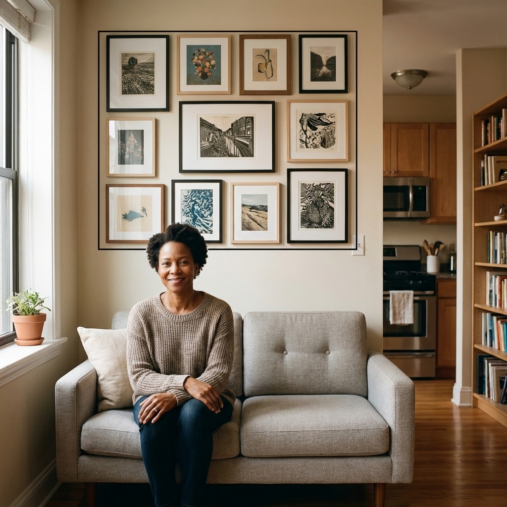
- Rectangle: cleanest and most modern, great above sofas and beds
- Arch top: softens harsh corners, lovely in hallways or near an entry
- Organic cloud: more boho and playful, best when spacing is consistent
In tiny apartments, a rectangle is the easiest way to get maximalism without visual noise.
Right-size guidelines
- Above a sofa: a common rule of thumb is about two-thirds the sofa width for the overall gallery wall width.
- Above a bed: similar guideline, about two-thirds the headboard width.
- In a narrow hallway: keep the gallery wall height centered at eye level and avoid frames that stick out too much.
If you cannot hit these perfectly, do not stress. The real goal is to make the gallery wall look anchored to furniture instead of sprinkled randomly.
Frames that look polished
Frames are the visual punctuation marks. In a small space, too many different punctuation styles can feel messy fast.
Use mats to create calm
Mats give art a margin, and margins are what your eyes interpret as order. If you can only upgrade one thing, upgrade your mats.
- Go wider than you think: a generous mat makes even a tiny print feel like real art.
- Match mat tones: keep them all warm white or all bright white so the wall reads cohesive.
- Float mount for variety: one or two float-mounted pieces add depth without adding clutter.
Limit frame finishes
Two finishes is ideal, three max. My favorite small space combo: black + light wood. It gives contrast, stays timeless, and plays nicely with most rentals.
Keep glare under control
If your gallery wall faces a window, glare can make it feel visually noisy because the reflections jump around. Consider:
- placing the wall on the side wall, not the wall directly opposite a window
- choosing matte prints for the most reflective spots
- upgrading one or two hero frames to anti-reflective (AR) acrylic if glare drives you nuts
Spacing that stops clutter
Spacing is where maximalist gallery walls win or lose. I treat this like furniture Tetris, just vertical.
Pick one gap
For most small apartments, aim for 1.5 to 2 inches between frames. Measure from outer frame edge to outer frame edge, not from the artwork inside the frame. Tighter feels intentional and gallery-like. Wider can start to feel scattered, which reads as clutter.
Align something
You do not need perfect symmetry, but you do need a few clean alignments so the eye can rest.
- Strong top line: several frames share the same top edge
- Strong center line: a vertical spine down the middle
- Strong bottom line: a base row that feels grounded
If your wall is above a sofa, I love a strong bottom line. It visually anchors everything to the furniture.
Give the wall a margin
Do not cram frames right into corners, door trim, or the ceiling. Leave a clear border of blank wall around the gallery wall. Even 3 to 6 inches makes it feel like one designed moment instead of a wall that is overflowing.
Layout it first
Hanging as you go is how you end up with 27 extra holes and a mild emotional spiral. Instead:
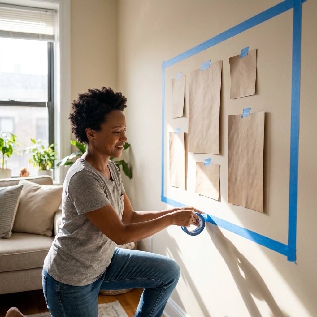
- Measure your container shape on the wall (width and height).
- Tape that rectangle on the wall using painter’s tape.
- Arrange your pieces on the floor inside the same dimensions. Start with the largest pieces, then fill in.
- Take a photo and view it in black and white. If it looks like a gray mess, you need more contrast or more quiet space.
- Trace frames on paper or use kraft paper templates. Tape templates inside your painter’s tape boundary.
This is the part where you feel like a dork. This is also the part where the finished wall looks weirdly expensive.
Hanging tips for renters
You can absolutely do a maximalist wall without losing your security deposit. The right hardware depends on frame weight, wall type, and your paint situation.
Choose the right method
- Light frames: removable picture hanging strips can work beautifully. Follow the manufacturer’s instructions for cure time, weight limits, and recommended surfaces, because some paints and finishes do not play nice with adhesives.
- Medium to heavy frames: use picture hooks or wall anchors rated for the weight. Fewer, well-placed holes are better than lots of random ones.
- Plaster walls: pre-drill carefully and use the correct anchors. If your wall fights back, do not force it, switch to lighter frames or a ledge.
Use rails or ledges
If you are constantly thrifting and rotating prints, consider:
- a picture rail molding (if you have one, use it)
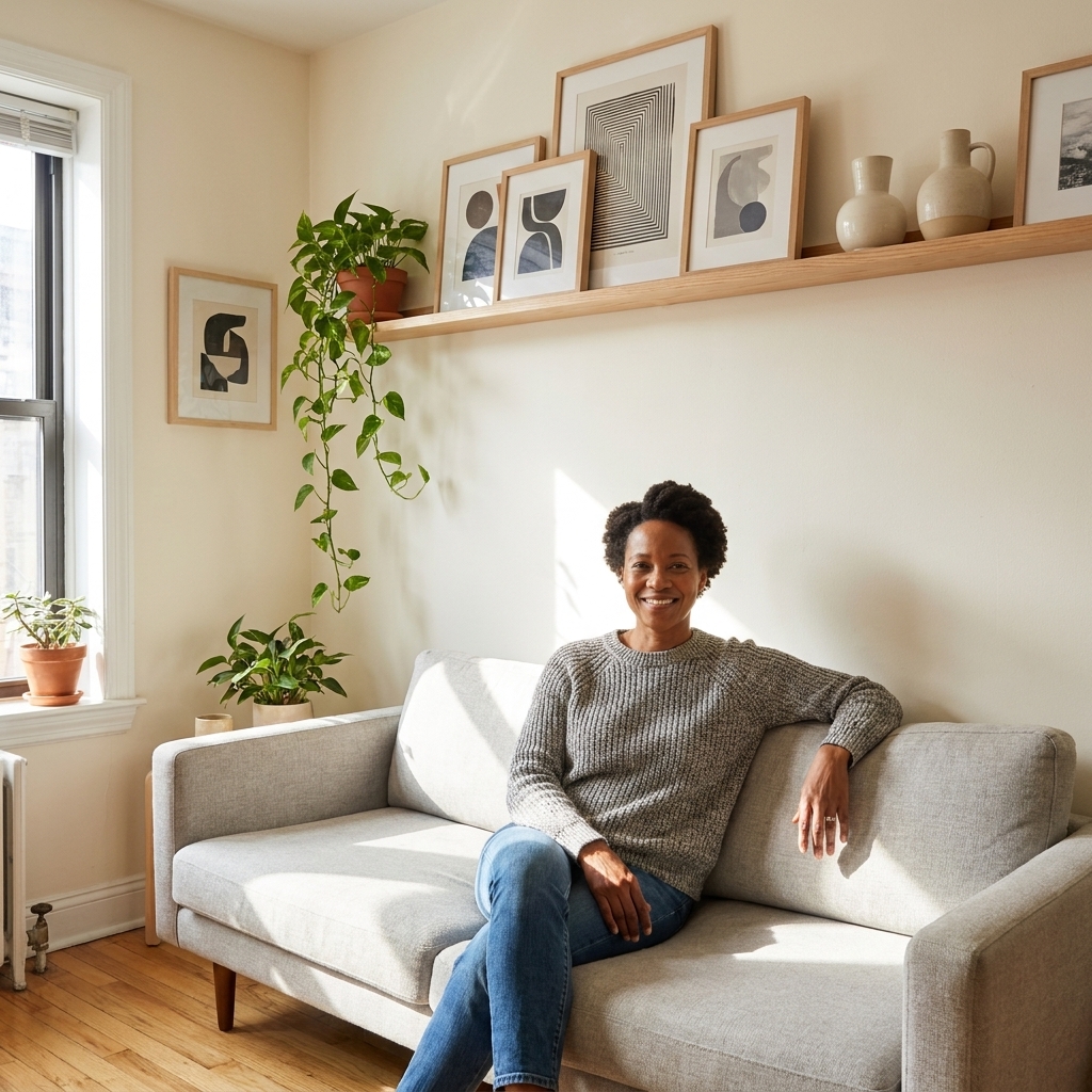
- two to three slim picture ledges stacked vertically
This gives you maximalist density with fewer holes and less commitment.
Quick safety note
If you are hanging anything heavy, use appropriate anchors or hit a stud, and be extra cautious above beds (or anywhere you sleep). If you live in an earthquake-prone area, museum putty or quake gel can add a little extra peace of mind for smaller frames.
Maximal, not messy
Add depth with one 3D piece
One small object breaks up a wall of rectangles and makes it feel curated. Try:
- a tiny convex mirror
- a small textile in a frame
- a shallow shadow box
Limit yourself to one or two three-dimensional pieces in a small space so it does not start to feel like a shelf exploded.
Control the color story
If your art is colorful, pick a repeating palette of two to four colors that show up in multiple pieces. You are not matching, you are echoing.
Balance contrast
Too many high-contrast pieces (black, white, bold graphic) can feel hectic. Mix in softer tones and mid-contrast art to keep it livable, especially in a bedroom.
Mind the clutter zone below
A gallery wall looks cluttered when the area under it is cluttered. If your wall is above a console, keep the surface edit tight:
- one lamp
- one tray for keys or remotes
- one plant or sculptural object
Your art deserves a calm landing strip.
Best spots in small apartments
Placement matters as much as layout. These are my favorite spots when square footage is stingy.
- Above the sofa: the easiest way to make a rental living room feel finished.
- Over the bed: instant boutique hotel energy, just keep heavier frames properly anchored.
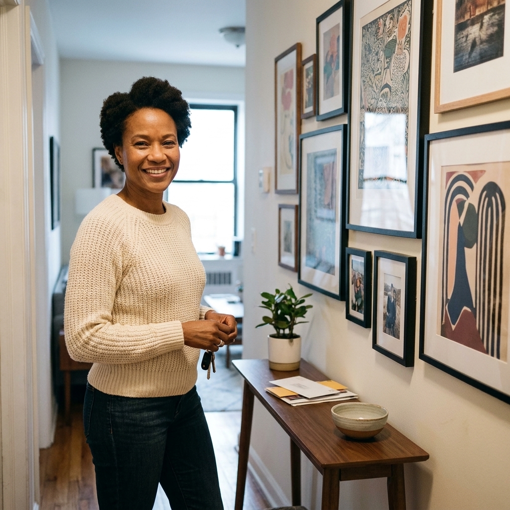
- Entry wall: creates a moment the second you walk in, even if your entry is basically a slice of hallway.
- Dining nook: makes a tiny table feel intentional, like you meant to have a dining area.
Quick troubleshoot
Problem: It looks random
Fix: tighten spacing and create a clear outer shape boundary. Then swap in matching mats for the busiest section.
Problem: The art is fighting
Fix: remove one to three loud pieces and replace them with quieter art or larger mats. Maximalism still needs pauses.
Problem: It feels too high or low
Fix: a common guideline is to place the center of the overall arrangement around 57 to 60 inches from the floor (roughly average eye level), then adjust for ceiling height, seating, and the actual humans who live there.
Problem: It feels heavy on one side
Fix: move one dark or highly saturated piece to the lighter side. Visual weight is real, even when the frames weigh nothing.
A formula to copy
If you want a no-spiral starting point for a small living room:
- 1 large anchor piece (18x24 or similar) slightly off-center
- 2 medium pieces (11x14 to 16x20) to balance left and right
- 6 to 10 small pieces (5x7 to 9x12) filling the perimeter
- All mats in the same white
- 1.5 to 2 inch spacing
- Outer shape: rectangle
This gets you maximalist density without that “my wall is yelling at me” feeling.
FAQ
How many frames is too many?
It is less about the number and more about the boundary. A small wall can handle 15 to 25 pieces if spacing is consistent and the arrangement has a clean outer silhouette. If your gallery wall starts creeping toward adjacent corners and door trim, it will feel like clutter.
Should frames touch?
I skip touching frames in tight quarters because it reads chaotic fast, and it makes future swaps tricky. Tight spacing, yes. Touching, usually no.
Can I mix photos and art?
Yes, and it looks amazing. To keep it cohesive, give photos a consistent treatment: all black-and-white, all warm-toned, or all the same border or mat style.
What if I cannot make holes?
Use removable hanging strips for lighter frames (again, follow the manufacturer’s surface and cure guidance) and build density with a couple picture ledges. Layer frames on the ledge and overlap slightly for a maximalist look that is easy to edit.